The tech world is abuzz with the latest iPhone 17 dummy units, and let’s just say, the reactions are as varied as a box of chocolates. Some folks love them, while others think they look like they fell out of a design competition gone wrong. The unveiling of these dummy units provides us with a unique opportunity to delve into the wacky world of smartphone design and explore why the Internet can’t seem to make up its mind about them.
What’s New with iPhone 17 Dummy Units?
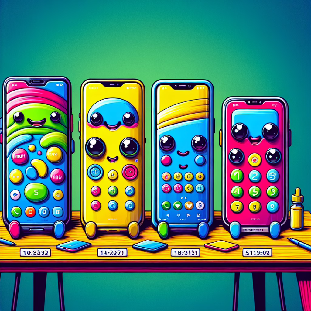
First up, let’s talk about these new iPhone 17 dummy units. For those who might not be in the know, a dummy unit is essentially a non-functional model that manufacturers use for testing and marketing displays. While we can’t take selfies with them just yet, we can certainly admire (or critique) their aesthetics.
The four models on display include the standard iPhone 17, the iPhone 17 Plus, and the more premium iPhone 17 Pro and Pro Max. Each one boasts its unique flair, but judging by the Internet’s reaction, that flair may not be enough to save them from harsh judgment.
Design Choices: Love It or Leave It?
When it comes to design, Apple usually hits it out of the park. However, some critiques suggest that this time around, they might have tripped over their own shoelaces. The iPhone 17’s rounded edges have sparked a heated debate—are they sleek and modern, or just reminiscent of a rubber duck? The colors are vibrant, but they also beg the question: Is this a phone or a piece of candy? While some folks find the choices delightful, others are left scratching their heads.
It seems that Apple decided to throw caution to the wind, letting their designers have a bit too much fun with the color palette. We’ve got colors that pop louder than your grandma at a bingo night! The hues range from classic silver to eye-popping neon green—perfect for those who want their phone to be noticed from space. This bold approach aligns perfectly with Apple’s strategy of standing out in a crowded market, something that goes hand-in-hand with their brand identity.
The Internet Reacts: A Symphony of Opinions
As expected, social media erupted with opinions about these iPhone 17 dummy units. Memes flew faster than you can say “Apple Inc.” One Twitter user hilariously compared one model to “a fridge that got into an argument with a rainbow.” Another remarked that these phones look like they belong in a children’s toy store rather than a high-tech gadget shop.
But fear not, Apple enthusiasts! Not everyone is throwing shade at these new designs. Some die-hard fans are defending the aesthetics passionately. They argue that bold design choices set Apple apart from its competitors and embody a spirit of innovation. It’s fascinating how being quirky can spark such fervor! This interaction between design and user opinion illustrates the dynamic relationship between a brand and its audience.
Technical Specs: The Backbone Behind the Looks
Now, while the aesthetics may have sparked debate, let’s not forget about what truly matters—the technology inside these charming shells. The iPhone 17 is rumored to come equipped with an upgraded A17 chip, promising faster performance and improved battery life. Imagine scrolling through TikTok videos at lightning speed without worrying about your phone giving up on you mid-scroll!
Moreover, reports suggest enhancements in camera capabilities—think night mode that actually works in low light without rendering your friends into shadowy figures. And let’s not overlook battery life; it seems Apple is determined to keep you glued to your screen for hours on end (you’re welcome!). With these technical advancements, it’s clear that while opinions on design may vary, the performance is set to impress.
A Comedic Conclusion: Will You Join the iPhone Craze?
In conclusion, whether you love or loathe the new iPhone 17 dummy units, one thing is for sure: they’ve given us plenty to talk about! As we gear up for the official release later this year, we’re left wondering how many more memes will emerge from this quirky batch of designs.
So what do you think? Are you ready to embrace your inner rainbow-loving techie, or do you believe it’s time for Apple to tone it down just a smidge? Drop your thoughts below—we’d love to hear your opinions!
A big shoutout and thank you to TechRadar for their insights on this topic. For additional insight into Apple’s recent developments, check out our article on Apple and Meta hit with €700m of fines by EU.